If your medical website fails to generate leads, that is, visitors do not book appointments, call in or fill out contact forms, the culprit is not traffic. Your website should behave like a lead‑generation machine that leads visitors all the way to a booked appointment.
Indexed studies indicate that user experience, trust and clean conversion paths make up a well-designed healthcare website and can lead to increased appointments with patients. A study testing an optimized design found that conversion grows when visual elements and user experience are balanced correctly.
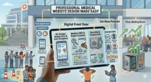
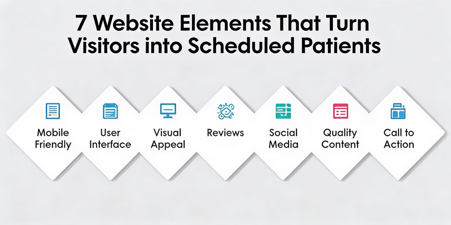
This guide explains 7 Website Elements that help turn visitors into real patients. It focuses on strategies that encourage people to book appointments
7 Website Elements That Turn Visitors into Scheduled Patients
1. Mobile‑First, Fast & Easy Navigation
Today, most people searching for healthcare services do so on mobile devices. Google’s mobile‑first indexing also means your site must function perfectly on phones and tablets.
What Works
- Responsive design: Forms adjust layout automatically for phones and desktops
- Load pages fast: delays are annoying for users, and they increase bounce rate
- Straightforward menus: doesn’t have sections like Services, About, Contact
- Sticky navigation: make it easy for visitors to find information without scrolling forever
People searching for care are often in pain or under stress. A confusing menu or slow load time creates friction that sends potential patients to a competitor.
2. Professional, Trust‑Building Homepage
Your homepage is the first impression many potential patients get of your practice. It’s not enough to look “pretty” — it must immediately communicate professionalism, trust, and clarity.
What to Include
- Clean layout and branding: no clutter
- Headline that speaks to patient needs: e.g., “Comprehensive Family Medicine in Richmond, VA.”
- Clear value proposition: why patients should choose you
- Photos of you, your team, and the office: focus on emotional connection
Patients assess their sense of trust in a health care website. Clear messaging combined with polished design creates an impression of reliability, increasing conversion and decreasing bounce rates.
3. Clear & Compelling Calls to Action (CTAs)
Calls to action are one of the most discussed elements in every high‑converting medical website guide we analyzed. They tell visitors exactly what to do next and where to do it.
High‑Converting CTAs Include
✔ Schedule Appointment
✔ Call Now (clickable phone link)
✔ Request an Online Consultation
✔ Get a Free Guide
Best CTA Practices
- Place CTAs above the fold (top of the page)
- Use contrasting colors to stand out
- Repeat CTAs on every important page
Use action words “Book,” “Call,” “Reserve.
Even minor adjustments to the wording and placement of your CTA can improve conversions tremendously, as people frequently require a definitive course of action.
4. Informative, Patient‑Focused Content
It’s not just about SEO that lies at the heart of content, but rather answering exactly what questions your possible patients are searching. Using this, if your content solves problems, addresses concerns, and clearly explains services and processes are far more likely to convert.
Key Content Areas
- Service pages: spell out everything you treat, how you treat it and what patients can expect
- Team bios: introduce your doctors and credentials, help visitors feel comfortable
- Blog posts: answer frequently asked questions such as “what to expect at your first visit” or “how to prepare for surgery.”
- There is a well-known quote in the SEO world: Google considers medical content as higher tier (“Your Money or Your Life”); therefore, well-written and fact-checked content helps your site get listed high on search results.
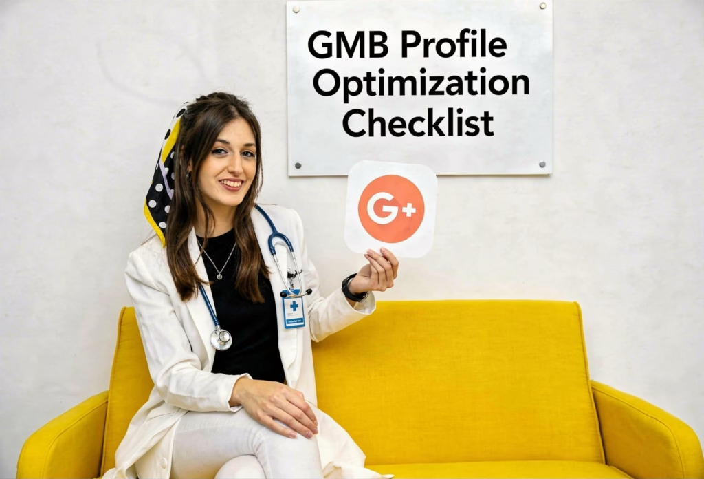
5. Trust Signals That Build Credibility
Before patients make an appointment, they want to know that the provider they are seeing is reputable and trustworthy. Such elements are often part of the entire conversion path of a website, not just one page.
- Must‑Have Trust Signals
- Patient testimonials and reviews
- Certifications and board credentials
- Professional affiliations
- Case results or success stories
When used correctly, studies show trust signals can increase conversion rates by 20% and up.
💡 Testimonial tip: Have both written and video testimonials where possible — video offers the kind of authenticity and emotion that falls short in text.
6. Online Booking & Easy Contact Options
Visitors often leave without converting because the process to book an appointment is unclear or difficult. Making contact easy and immediate drives more leads.
Conversion‑Boosting Features
- 24/7 online booking
- Clickable phone numbers for mobile users
- Minimal‑field contact forms (don’t ask for too much info up front)
- Live chat or chatbot for quick questions
- Map integration so visitors can see your location instantly
People are more likely to book if they can do it within seconds, no barriers, no confusion. Online booking tools that remind visitors and allow self‑scheduling increase conversions dramatically.
7. Clear Conversion Paths & CRO Optimization
Conversion doesn’t happen by accident. It happens when you design the path that visitors should follow. Optimizing this path — sometimes called Conversion Rate Optimization (CRO) is a major trend among high‑performing healthcare websites.
What CRO Looks Like
- Logical flow from homepage → services → booking
- Highlight benefits before asking for action
- Testing headlines, buttons and layouts via A/B testing
- Monitor what visitors did to track where they drop off
- Small data‑informed changes like changing button color or implementing simpler forms have proven to increase conversions significantly.
- 💡 Pro tip: Analytics and tools like heatmaps can show you where people are clicking most. Once you know what they’re drawn to, make adjustments to guide them where you want them to go.
How All These Things Come Together?
You can think of each element as a link in the chain: If one is weak, you don’t convert. So, here is a detailed explanation of how the conversion process takes place:
- Step 1: Someone visits from a search or ad
- They stay on the page because of responsive design and clean navigation
- Trust‑building homepage makes them feel comfortable and validates that they are in the right place
- Patient‑focused content answers their questions
- CTAs and contact options make scheduling easy
- Testimonials and trust signals make them feel safe.
- Analytics and CRO tools improve over time
All combined, these elements turn a webpage from an electronic brochure intoa lead‐generating machine.
Conclusion
Your medical practice website should not just be used; it must work. It’s time to start treating your site like a strategic tool, not a simple page, if you’re not receiving leads. The websites with the best conversion of visitors into scheduled patients look and feel optimised for mobile users, trust, clarityand simplicityit, and simplicity,y while offering multiple routes to take action.
Incorporating these 7 elements from effective calls to action to optimized content and trust‑building features will help you convert passive visitors into appointments and real patients with confidence in your care.
Frequently Asked Questions
How long does it take to see results after improving website elements?
Typically, measurable improvement in leads can occur within 4–8 weeks of implementing changes, depending on traffic and design complexity.
What is the single most important element for conversions?
A clear and visible call to action like “Book Now” or “Schedule an Appointment” consistently drives the most direct conversions.
Why does mobile optimization matter?
Over half of healthcare searches now happen on mobile devices, so a responsive design improves user experience and increases conversions.
Do blogs really help with lead generation?
Yes, patient‑focused blog content can answer search queries and boost SEO, bringing more qualified visitors who are ready to convert.
Should I include patient reviews on my website?
Yes, reviews and testimonials are critical trust signals that can boost conversions and reassure nervous patients.